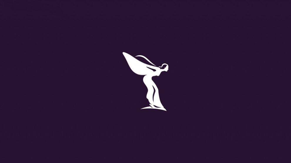
When Pentagram was updating the Spirit of Ecstasy emblem, they said that they wanted to pay their respects to the widely recognized double-R monogram by leaving it unchanged. Pentagram’s partner Marina Willer shared her thoughts on the redesign, “…it was too complex to be used on digital formats, and it didn’t feel modern or well-balanced anymore…so it was time we redrew it to make it feel like it was moving forwards.” Following the theme of “moving forwards”, the designers decided to flip the preceding icon to right-facing from left-facing.

To eliminate the confusion of the figure being an actual person, the team at Pentagram added a slim foundation under the figure’s feet and decreased the number of reflective marks. The team also made meticulous alterations to the figure’s physical attributes which included the detailing on the face, the size of the waist and the shape of the wings. The reason behind this as Willer explains, “…we didn’t want to indicate that she was too skinny, as that wouldn’t set a good example, and we didn’t want to make her too feminine and sexual either.”
Pentagram also produced an elegant, abstract version of the statuette resembling “a silken fabric” by inputting a variety of codes through a processor. The processing created a pattern of multiple parallel lines that curve and overlap to form the shape of a female figure- The Spirit of Ecstasy expression, to be used across the company’s branding.

The meticulous rebranding efforts did not stop there as Pentagram also reworked the company’s wordmark. This meant changing the typeface from Gill Sans Alt to Riviera Nights, which features a beveled effect for the letters L and E, once again fitting the theme of “moving forwards.” All the letters of the monogram have also been capitalized to create a stronger instant visual connection.
The Spirit of Ecstasy symbol is going to be used as the company’s primary logo starting September 1, 2020.


